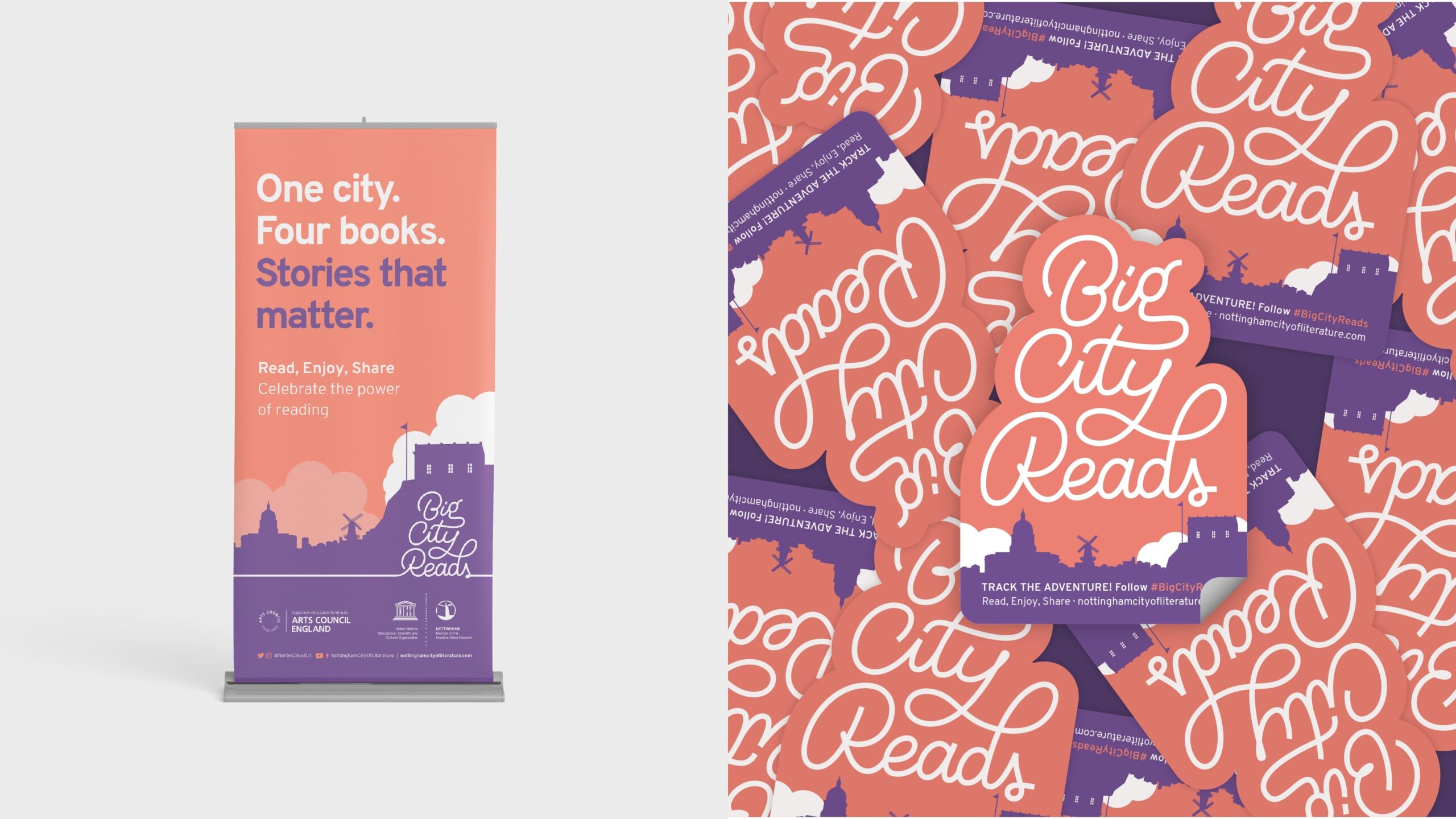
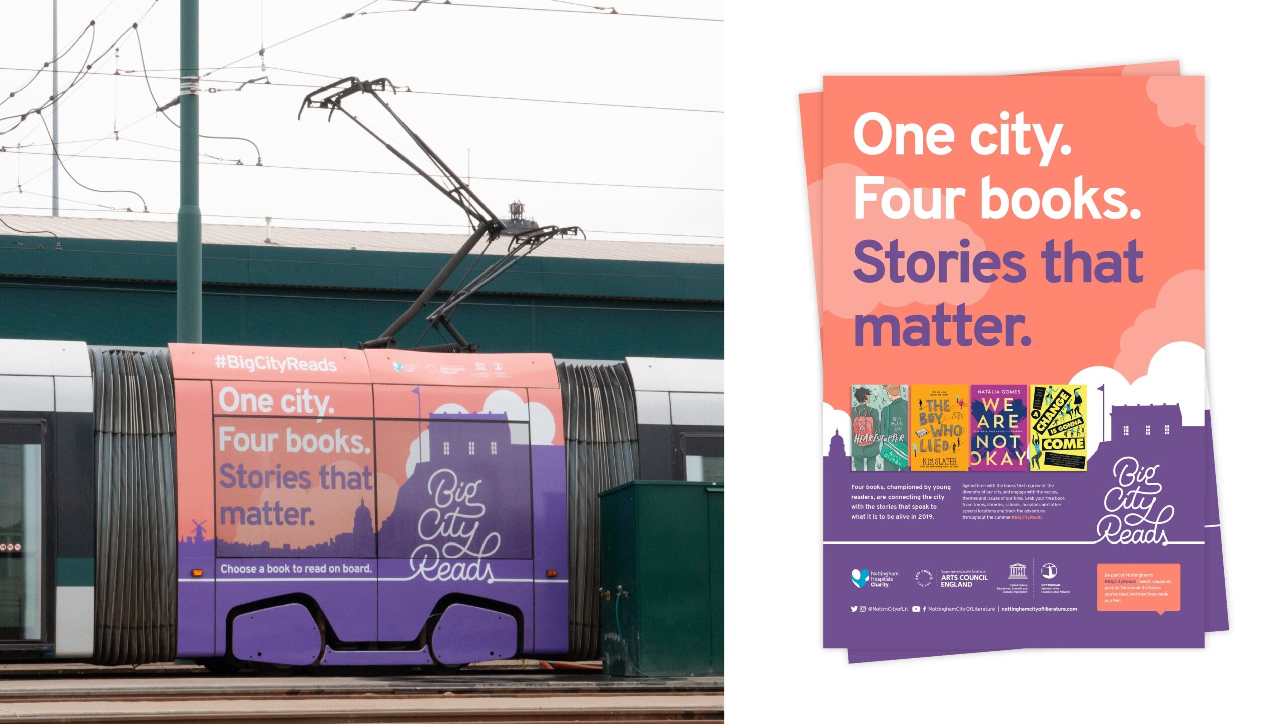
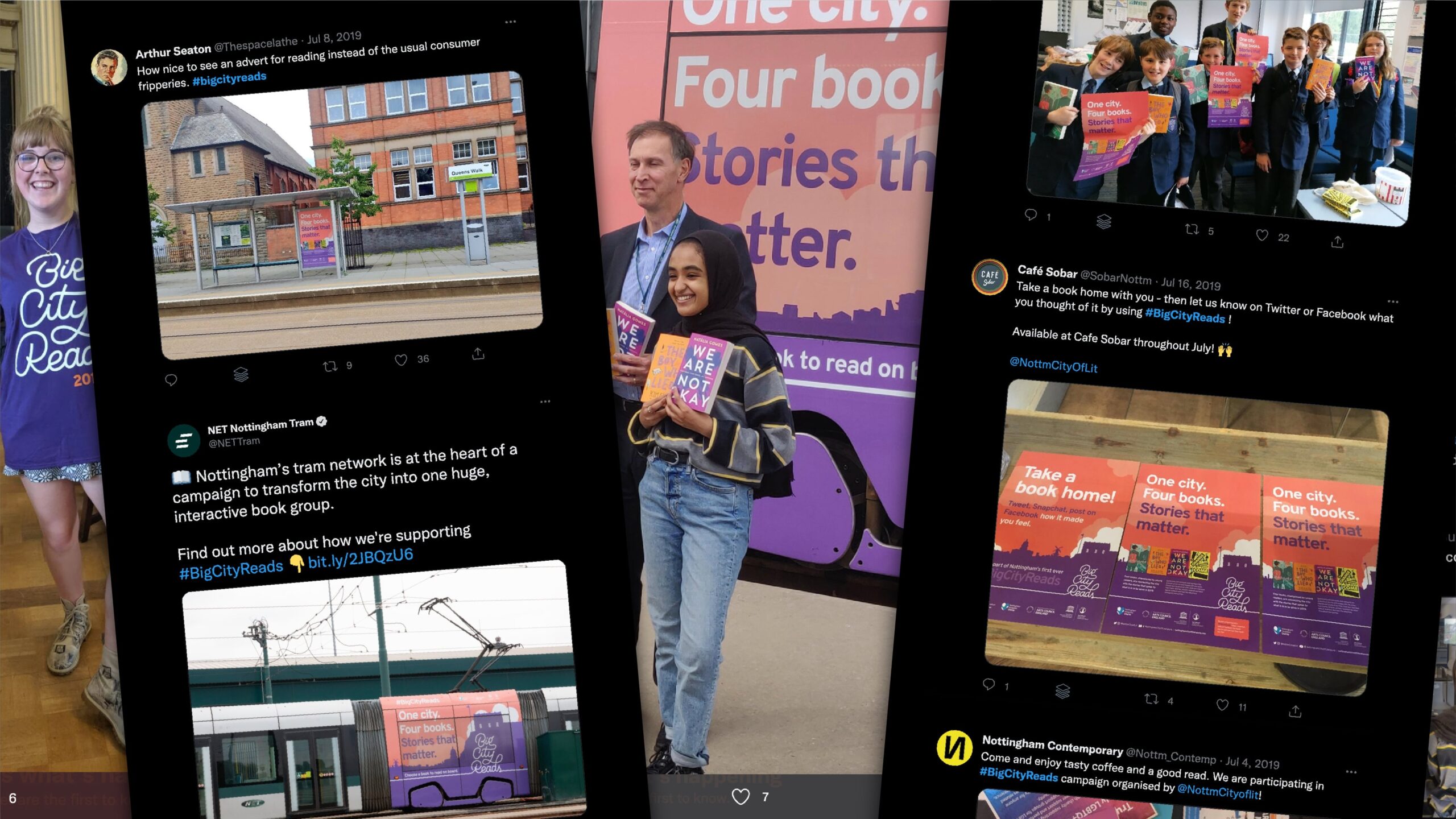
In 2019, Nottingham UNESCO City of Literature started Big City Reads - a city-wide reading campaign aiming at fostering a positive attitude to reading, by exploring books together as a community.
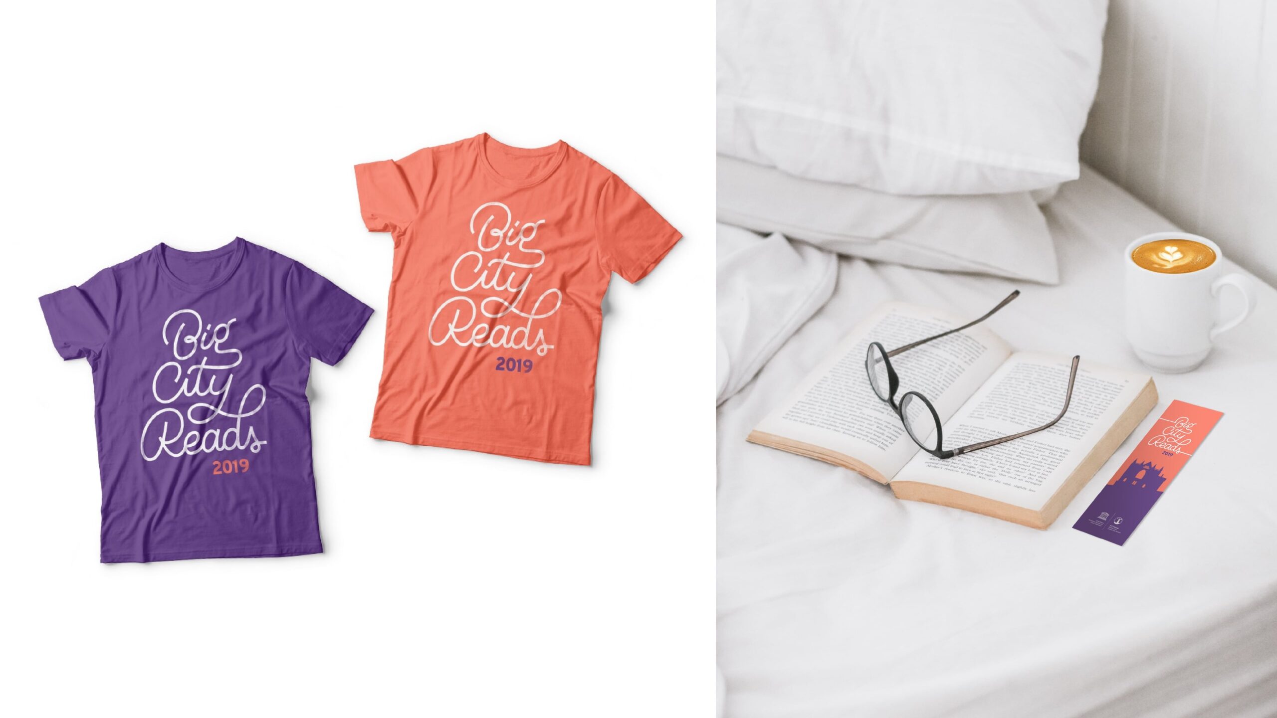
Hundreds of free books had been placed at a variety of venues around the city as well as the city trams, for Nottingham’s residents to pick up, take home and read.
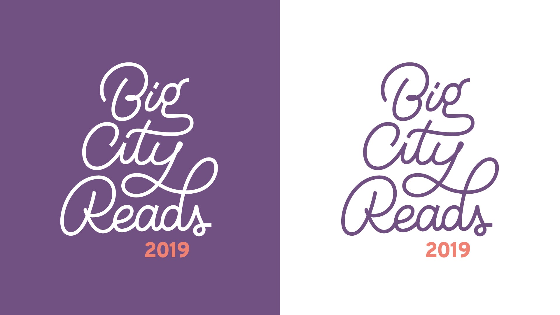
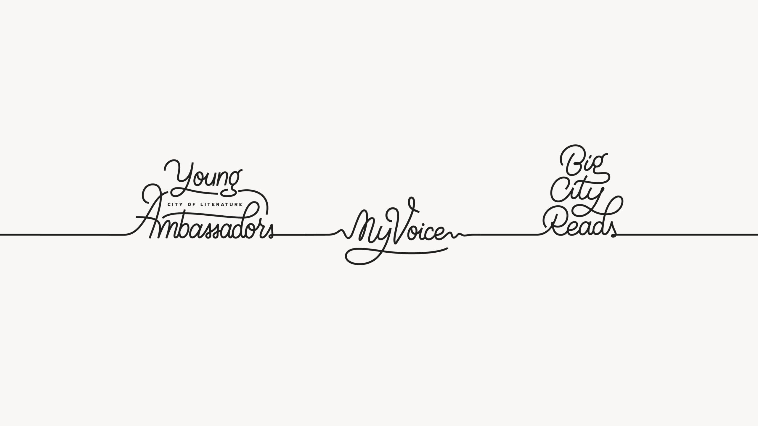
Big City Reads is part of a larger series of projects aimed at young adults, all of which had a custom script logotype created using the same lettering style. They can all be either used individually or as a group, connected by one continuous line.
The logotype was first hand-drawn, and then further adjusted and corrected by polishing the letterforms and adjusting the layout when creating a fully digitised vector version. The style aims to appeal to young adults, by looking casual, playful and friendly.
Karla is a brilliant designer to work with, and not just for her considerable talent in creating designs that exceed a brief; but something extra. She has that crucial ability to be able to entirely engage with a subject: while some designers would be happy to merely follow instruction, Karla will actively work to understand thoroughly, and interpret exceptionally, ensuring we were kept in the loop entirely.
Matt Turpin
Communications Coordinator, Nottingham UNESCO City of Literature